ATL Live | ANF Lifestyle Brand
Logos
Primary Logo
Color Palette
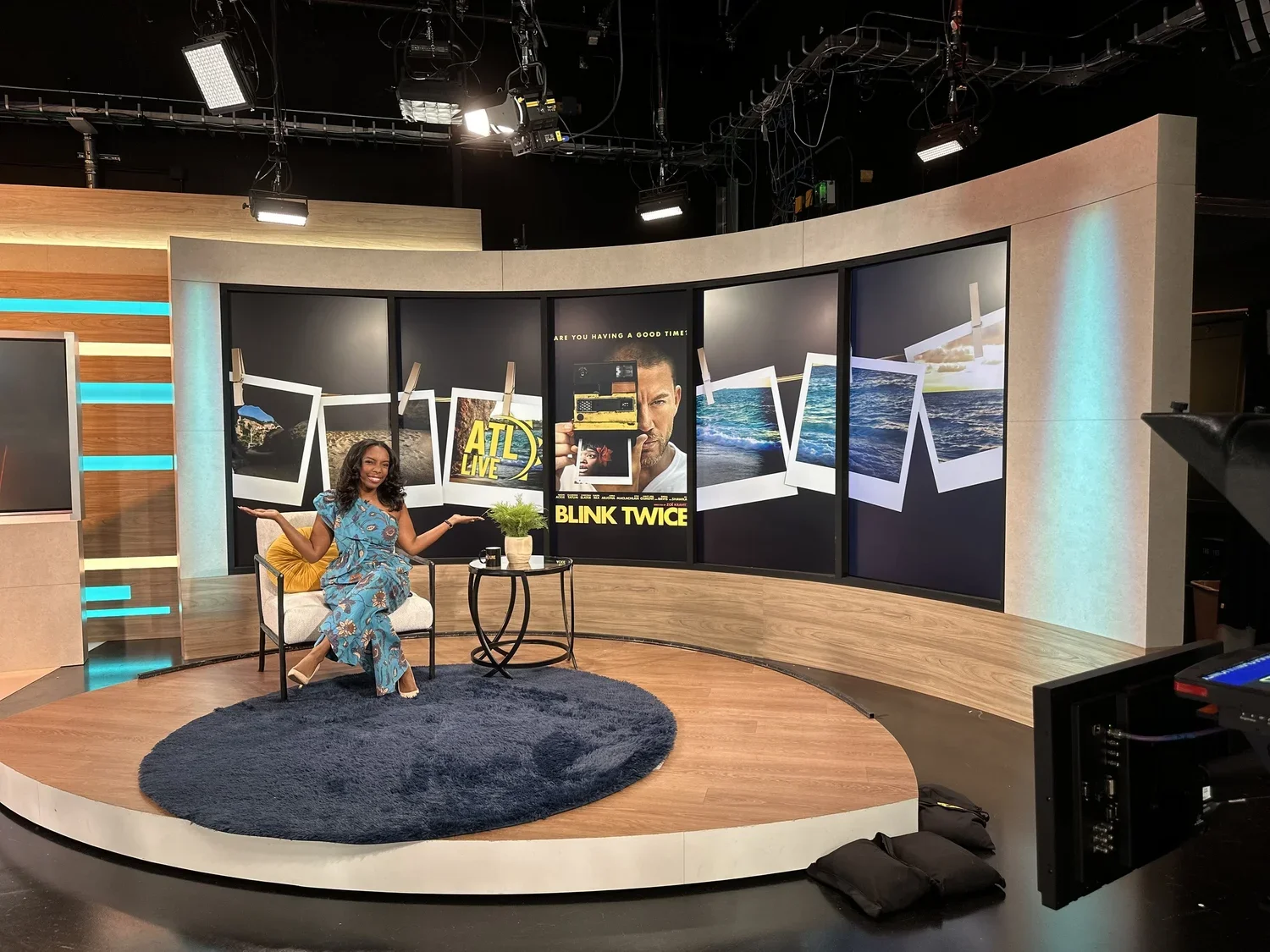
Set Design
Inverted Logo
From left to right: White (#FEFEFE); ATL Live Navy (#0A2D4B); ATL Live Teal (#39C5B1); ATL Live Yellow (#F89E23) Bottom: ATL Live Red (#F31835)
Fonts
Exploring the use of AI
In the spring of 2025, ATL Live had the pleasure of sitting down with legendary host, Phil Keoghan to discuss Season 37 of The Amazing Race. In the spirit of competition, the team requested several set pieces to use throughout the interview. These included:
A single monitor divided into 5 panels (referred to as the interview set) measuring 5400 px X 1920 px. [visible at 0:17]
A single continuous monitor (referred to as a wallpaper monitor) measuring 4800 px X 1440 px. [visible at 2:28]
A standard monitor (referred to as the weather wall) measuring 1920 px x 1080 px. [visible at 4:20]
Presented with this request, I decided to experiment with Adobe’s Generative Fill tool, something that had been limited previously due to concerns of inaccurate visuals (crucial in the news world). Since this was a marketing and promotional segment, there was freedom to play with AI. Using an image from Adobe Stock of the Amazon River. Finding imagery to fill a giant monitor can be challenging, especially when the monitor is one continuous piece. Using Adobe’s Generative Fill, I was able to extend the green foliage of the image to fill the remaining area of the screen. Then, to make it seem more natural, I softly blurred the outer edges, making the river the focus point.
Brand Brief
Bold. Energetic. Playful. This is how the ATL Live team describes their brand. The show’s light and casual atmosphere lent itself to focus on brighter and bolder colors. White as the foundational neutral keeps the brand fresh and allows for the other colors to play a bigger role. Navy acts as the “dark neutral” avoiding the seriousness and dramatic contrast of black. Teal brings the contemporary boldness and is a twist on traditional greens and blues used in lifestyle brands. The teal keeps it more flexible so as not to seem to health-focused. The golden yellow is a secondary color that provides fun contrast against the navy, whereas the teal can somewhat fade in certain situations (i.e. thin lines, small text). The yellow also makes that connection to the morning, when the show airs. Lastly, a striking and vibrant red is a secondary accent that bridges ATL Live to ANF, who’s brand color is primarily red.
Typography remains consistent with ANF’s fonts to help reinforce the relationship of the two brands. It still stands on it’s own as ATL Live’s go-to font with modern and clean lines that coincide with the brand’s contemporary “vibe".
Things I considered in building up their brand were:
While the goal is to engage with the entire community (ages 9-99), their target audience focuses on Millennials and Gen-Z (18-45). To accomplish this, they prioritize a strong digital presence on apps like Instagram, TikTok, and Youtube.
The bottom line is that this is a “sales” segment created to promote businesses and local communities. Their concern was coming across as too “car sales pitch,” hoping for graphics that felt more trendy and interactive.
Set Design
Templated Sets
Phil Keoghan Announces Season 37 of The Amazing Race
Source: ATL Live, March 4, 2025
Source: ATL Live, June 24, 2025
Prior to my departure from Atlanta News First in March of 2025, I made an effort to leave behind some “plug and chug” assets for the ATL Live team. The term “plug and chug” is common in my templates meaning that everything is ready to go with the exception of layers that need to be updated. In the case of this wallpaper monitor, this template keeps all book segments uniform but still allows for some customization. The book featured gets swapped out in the original PSD file using smart objects. This way, the ATL Live team could generate their own sets after I left.
The importance of doing things like this for a team is that it is so organized and simplified that someone with minimal Photoshop experience can adjust the necessary layers. Especially since our team was already small to begin with, my pending leave was going to leave the team on their own.
This set continued to be used several months after I parted ways, showing that the team felt comfortable enough in the template that they could continue to generate their own graphical needs while remaining consistent with their existing branding.
Size: 4800 px X 1440 px Tools Used: Adobe Photoshop, Adobe Illustrator Date: June 2024
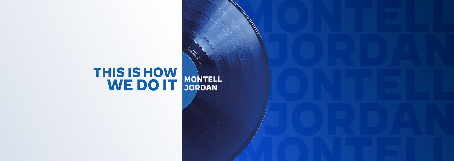
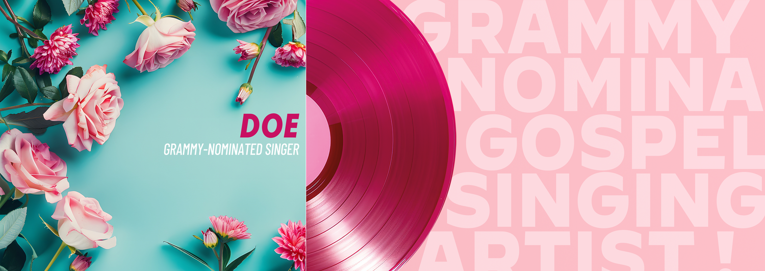
Musical Guests
Interview sets present a lot of challenges, especially when one monitor is made to appear like 5 separate panels. Layout is vital to successful set pieces and that is what made this so perfect. As seen in the video below, the spacing of everything creates perfect framing on different parts of the monitor. The other exciting aspect to this design is the adaptive nature, keeping the layout of elements and just customizing text and color.
Experimental Era
Some of my favorite designs came from working with this show. Requests were always a creative challenge for me (which I love) and every time, I was taking the opportunity to do something different. Part of my passion for the show and the people working on it was that they stood out from other station lifestyle segments. It wasn’t so forced and dull, there was always excitement on their set. The designs shown here are my more experimental monitors.
Size: 5400 px X 1920 px Tools Used: Adobe Photoshop, Adobe Illustrator Date: 2023
Size: 5400 px X 1920 px Tools Used: Adobe Photoshop, Adobe Illustrator Date: 2023
Size: 5400 px X 1920 px Tools Used: Adobe Photoshop, Adobe Illustrator Date: July 2024
Size: 5400 px X 1920 px Tools Used: Adobe Photoshop, Adobe Illustrator Date: August 2024
Titanic: An Immersive Voyage
This wallpaper monitor makes a statement. Although it did not make the cut for the segment, it was still a fun design to work on. This monitor was all in the details. The Titanic is all about it’s impressive size so scale was definitely my property of choice in laying this out. A realistically sized Titanic sailing calmly at sunset the night before disaster strikes. Off to the far right of the monitor, a glacier floating in the distance. The less realistic nature of the glacier’s design kept the graphic from feeling too grim and graphic. Though it is a well-known tragedy, ATL Live is not a platform for the darker side of the tale. The size of the logo isn’t overshadowing but a nod to the Titanic’s famous size. Looking closely, I went in and meticulously brought the ship to the foreground to flow with the logo.


