
Atlanta News First Rebrand
Static & Digital Design Elements

Logos
Primary Logo
Inverted Logo

Fonts
Color Palette
From left to right: ANF Black (#1A1A1A); ANF White (#FEFEFE); ANF Red (#C60101); ANF Accent Gold (#EAA943) **top to bottom in mobile display

Client: Atlanta Hawks (NBA)
Industry: Sports
Playing in the big ATL
Design Brief: Sports graphics are a unique challenge in the design world, especially when you are contending with the quality that a network like ESPN can provide. I didn’t have to stick to the traditional “news” aesthetic and was encouraged to have fun with the design. I started with looking around me and asked myself, “what does it mean to be from Atlanta?”
Atlanta is a well-known urban metropolis, nicknamed the New York of the South. Locals can recognize parts of the city like Midtown, Downtown, the Underground, the Battery, West vs. East Atlanta, etc. I focused my energy on the contrast of stoic concrete buildings and the local artists who use graffiti to bring life to the urban landscape. These ideas inspired an edgier, urban aesthetic that complimented the team’s brand.
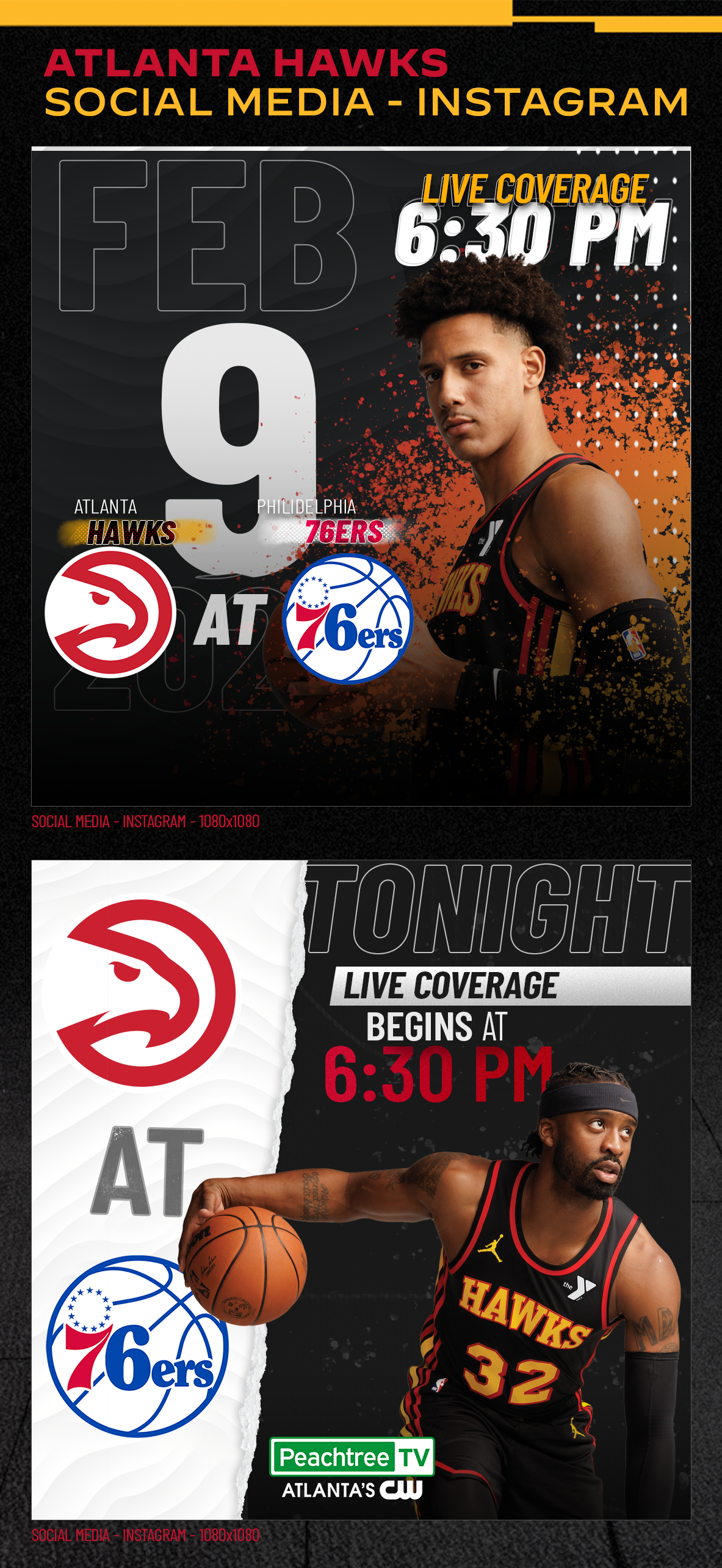
My philosophy in sports design is “you should feel the design coming to life.” Sports are very motion-oriented, a reason that ESPN primarily utilizes motion graphics for their assets. What I had to create was a sense of movement and action on a static canvas. Organic and abstract elements are the most successful at creating the effect of motion. Splattered paint, inspired by the graffiti found in Atlanta, helps to bring the players forward and bring them to life. The more dynamic nature of the game date and team matchups create emphasis and a sense of excitement as well.
Brand Brief
Atlanta News First stands for community first, original content and stories, and what it means to be a news station in the new age of social media, streaming, and the internet. Their fonts are bold and offer various weights to easily format brand assets including logos, headlines, body text, web page assets, set designs, and brand collaborations. They favor a high contrast and simple color palette, relying on black and white (and shades of gray) to act as neutrals against a bold, passionate red. Their secondary accent color is rarely used but is a subtle nod to the parent company, Gray Media (who uses primary colors of red, blue, and yellow).
Associated franchises that may be featured include:
ANF | Investigates — ANF’s investigative team’s personal branding under ANF’s primary brand.
ANF | Better Call Harry — ANF’s consumer investigative stories that come from consumer investigative reporter, Harry Samler.
ANF | First Alert Weather — ANF’s weather team brand, known for being the largest team of meteorologists at a local station in the state.
Surprise Squad — ANF’s charitable community segment that gives back to those who are pillars in their communities.
Peachtree TV — ANF’s secondary station that acts as Atlanta’s CW.
Peachtree Sports Network (PSN) — ANF’s extension of Peachtree TV that focuses on local and state sports.
ATL Live — ANF’s lifestyle segment that focuses on trendy restaurants, exciting activities across the state and southern region, fashion trends, health trends, and other lifestyle topics.
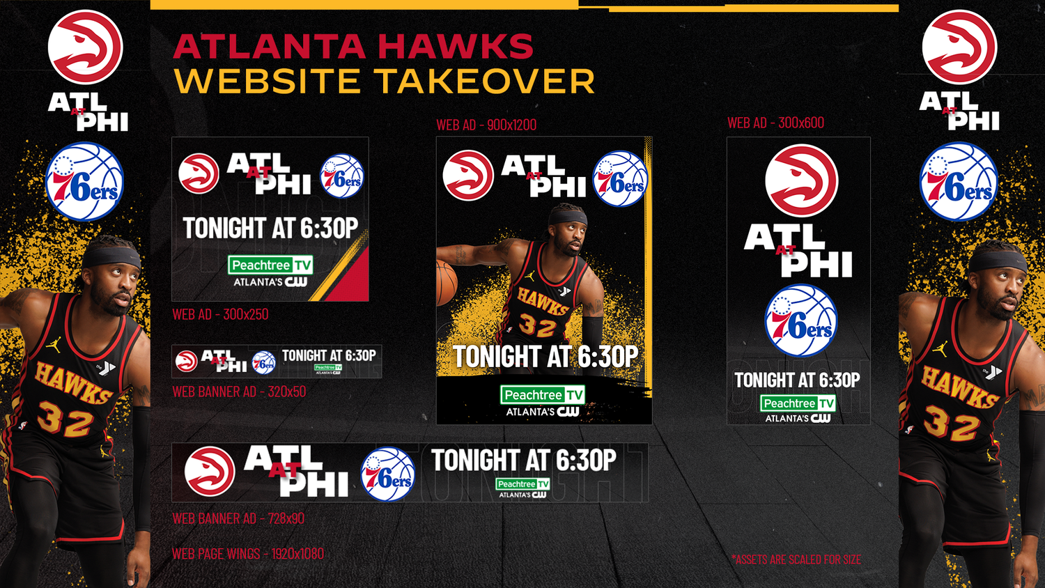
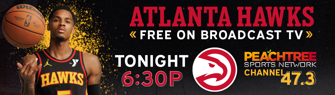
Teaming Up with Local Sports Teams: NBA
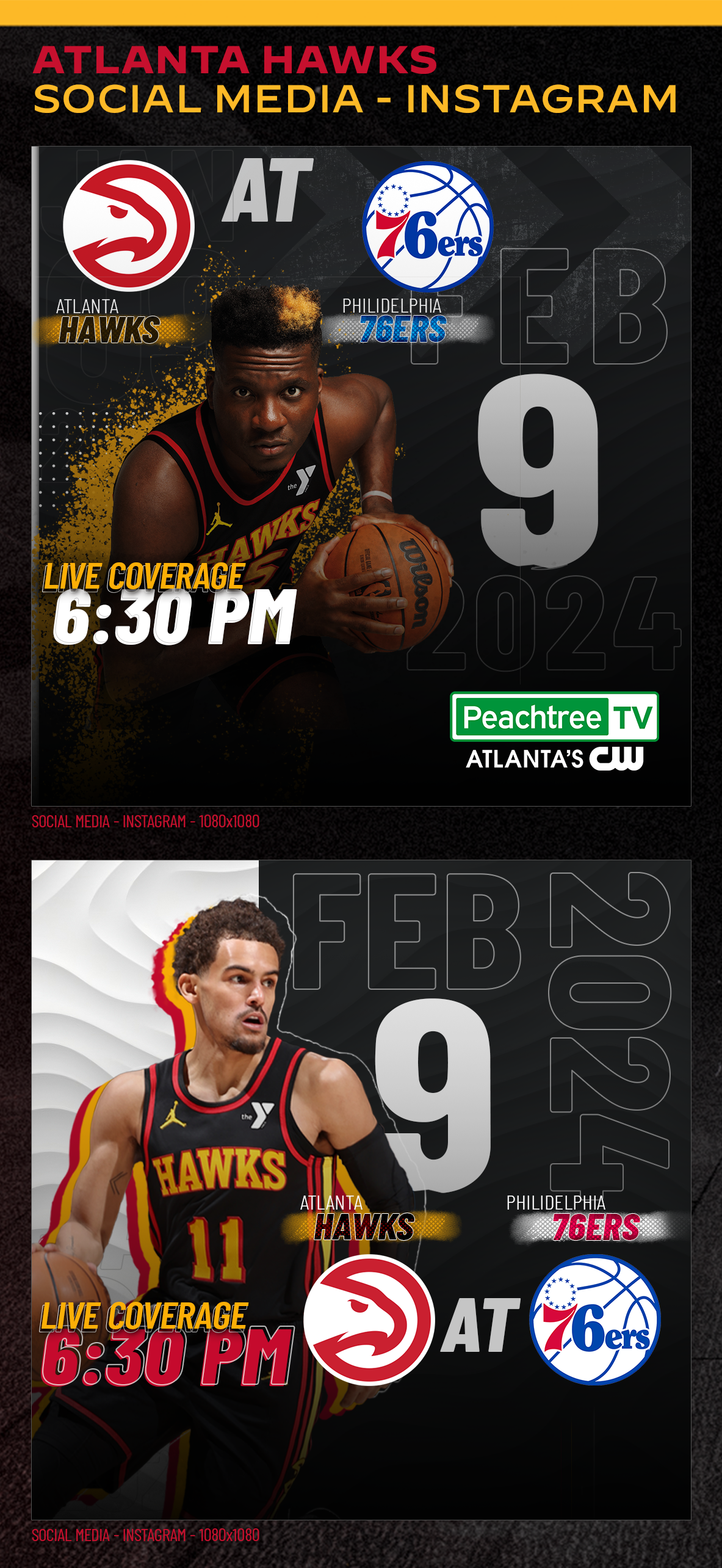
ANF teams up with the Hawks
Objective: Design a variety of web and social media assets that advertise Atlanta Hawks games featured on Peachtree TV and/or Peachtree Sports Network (PSN).
Design Inspiration: PSN was still in the early stages of design, with no logo to represent the brand’s identity. I was solely tasked with developing a guideline based off the Hawks’ team colors. Working on sports-centric graphics allows for more creative flexibility because they typically want to be bold and energetic.
Tools: Adobe Photoshop, Adobe Illustrator

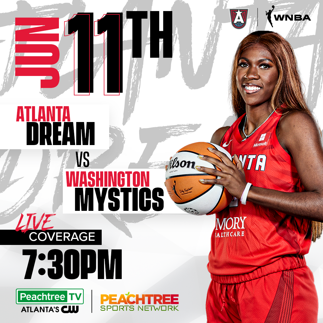
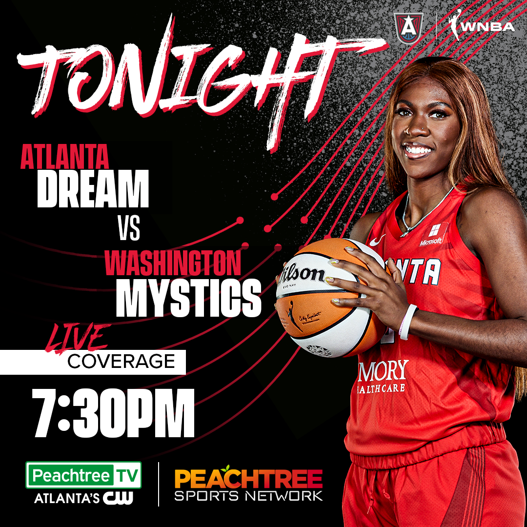
Teaming Up with Local Sports Teams: WNBA
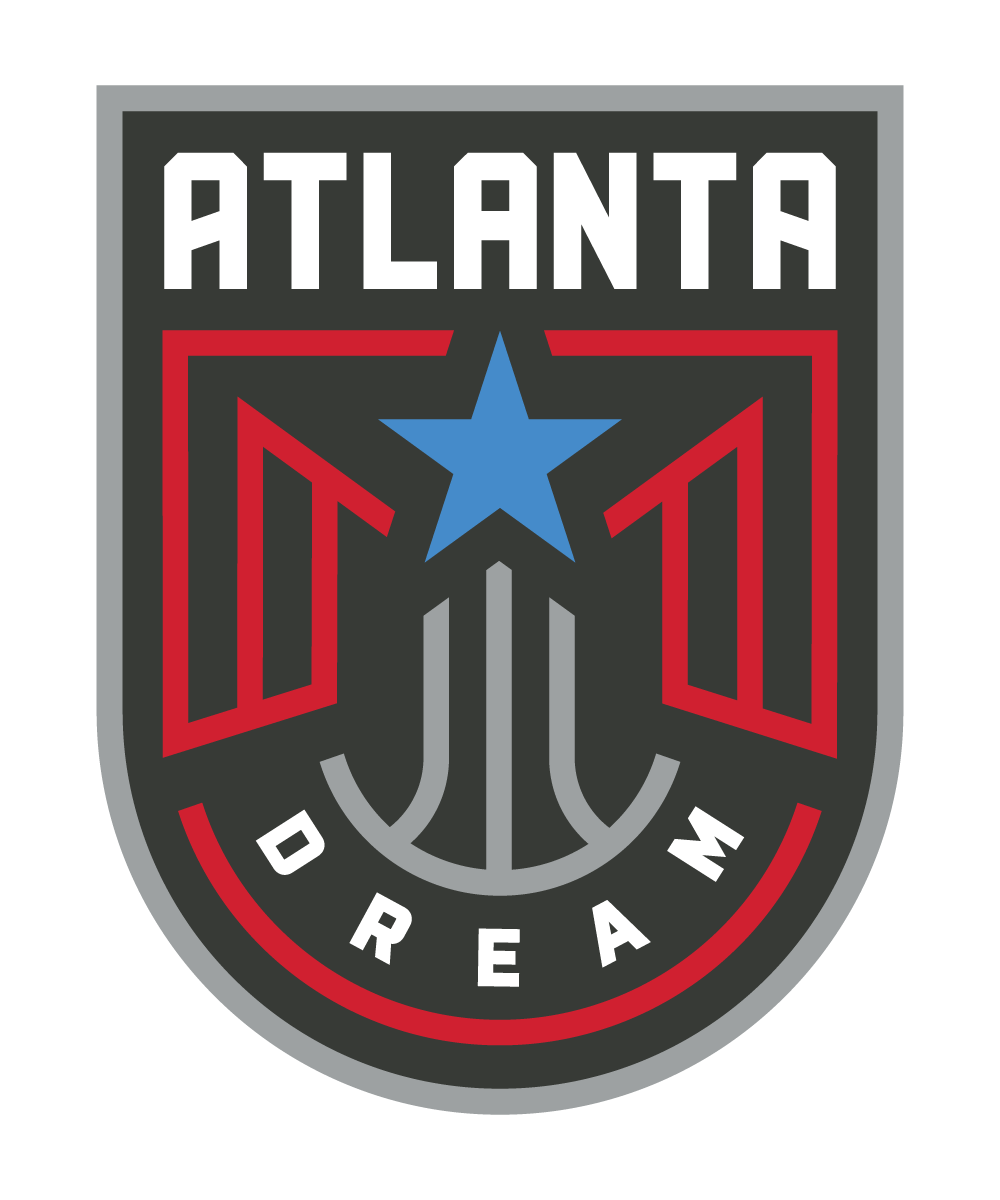
Client: Atlanta Dream (WNBA)
Industry: Sports
ANF teams up with the Dream
Objective: Design a variety of social media assets that advertise Atlanta Dream games featured on Peachtree TV and/or Peachtree Sports Network (PSN).
Design Inspiration: On top of designing graphics for the Atlanta Hawks, we needed to define a brand for Atlanta’s women's basketball team, the Atlanta Dream. The challenge was maintaining that same energy and dynamic in the Hawks’ package but doing it in way that distinguished it from the Hawks.
Tools: Adobe Photoshop, Adobe Illustrator
Big players in the ATL
Design Brief: As mentioned in my design brief for the Atlanta Hawks, sports graphics allow for more creativity and flexibility than traditional “news” graphics. They are meant to be engaging and dynamic, something that can be challenging when dealing with static media.
I wanted the Dream’s design to compliment the Hawks so I kept the graffiti inspired paint splatter. The team’s colors were very similar to ANF’s brand so playing with design elements and having more fun with the text created that distance so when you looked at it, you knew it was about the Atlanta Dream and not something associated with ANF’s news brand.
I also wanted maintain that feeling of motion and borrowed the lines from the Dream’s logo to create a graphical element that helps direct the hierarchy of information. This illusion is also enforced by utilizing a dark gradient that slowly fades into the background. Doing this also allows for a more striking contrast of the red text (Washington) and the red line elements.
A striking difference between the designs for the Atlanta Dream and the Hawks is how shapes influence each team. For the Hawks, graphical features tended to be sharp and squared off. In terms of the Dream, however, softer curves that can also be seen in their logo, reflect the female dynamic of the brand. Utilizing softer curves doesn’t soften the overall design, however, because the design remains very edgy and urban through typography.
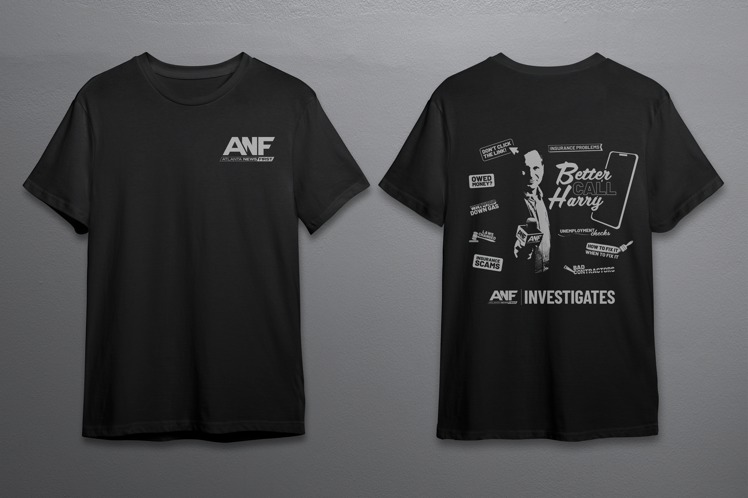
Represent: Designing wearable swag
Franchise: ANF | Investigates
Category of Design: Promotional Swag
Better Call Harry
Objective: Design a branded T-shirt concept inspired by Better Call Saul, blending investigative journalism themes with tongue-in-cheek, consumer-style advertising. The final goal was to introduce a new product that felt playful and approachable while still meeting stakeholder approval and brand expectations.
Design Inspiration: Drawing inspiration from “junky mailers”, bold billboards, and our consumer investigative brand itself, I created a design that balanced humor with professionalism.
The final product was approved by leadership and is still in active use (as of 2025), regularly given to featured guests as part of the show’s branding.
Tools: Adobe Illustrator, Adobe Photoshop
Social Media Influence: Sharing News Digitally
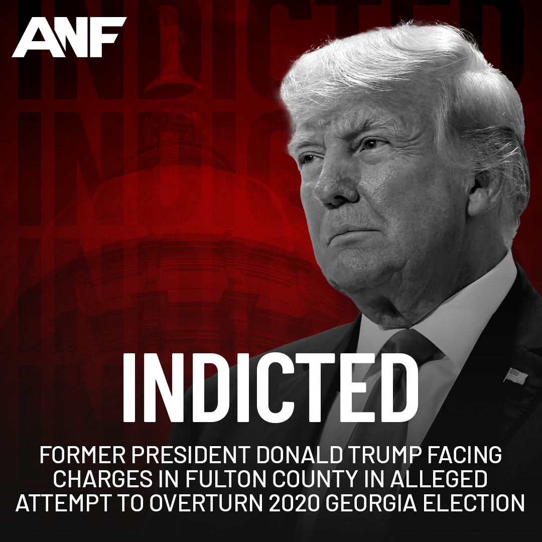
Franchise: ANF | Investigates
Category of Design: Social Media
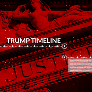
Trump Trial Social Graphics
Objective: Design a series of social media graphics following the coverage of Trump’s trial for Election Fraud in Georgia. These graphics should keep a serious and professional tone and align with the package design for Trump’s Trial.
Design Inspiration: In keeping with the on-air coverage, I maintained the colors associated with the ANF brand. Social graphics are meant to grab a user’s attention (bold lettering, high contrast, rich color).
The final design pulled in modern editorial styles, attracting the attention of audiences and increasing our coverage by 36%.
Tools: Adobe Illustrator, Adobe Photoshop